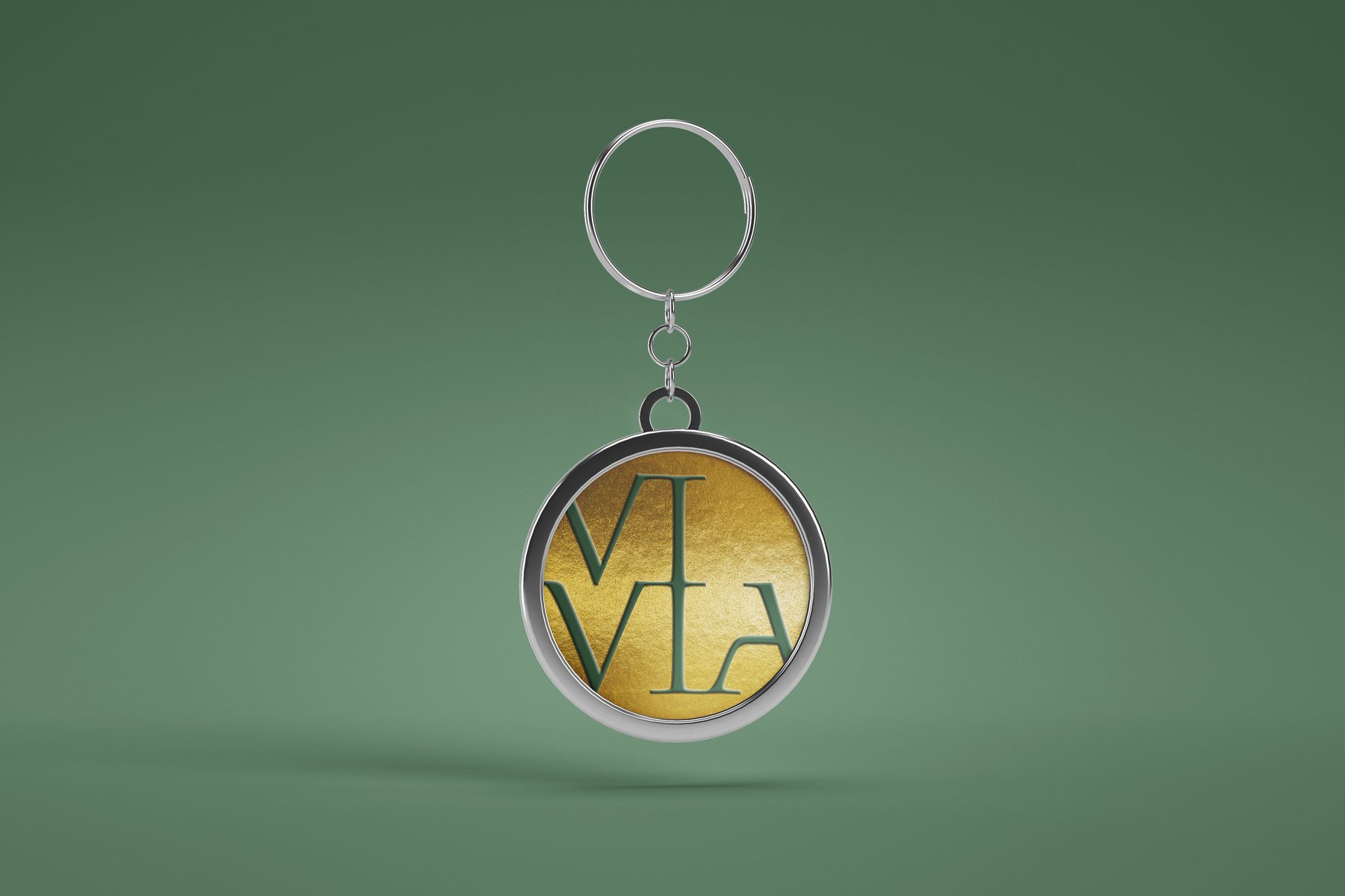
Vivia Jewelry Branding
Jewelry brand HanCai is a family-run jewelry business based in Shanghai, China. The Chinese characters of its name allude to the depth and fluidity of colours. HanCai aims to expand its business into North America, and commissioned me to create a new brand with a youthful but elegant design language able to support potential for international growth.
The brand name VIVIA was identified through an iterative process. It stems from the specialised term VIVID, a designation of the GemResearch Swisslab AG which describes the highest quality of colours. VIVIA reflects the life (vita) and intensity (vividness) that is the essence of gemstone beauty. The name has simplicity which gives it visual strength and invites a variety of visual treatment.
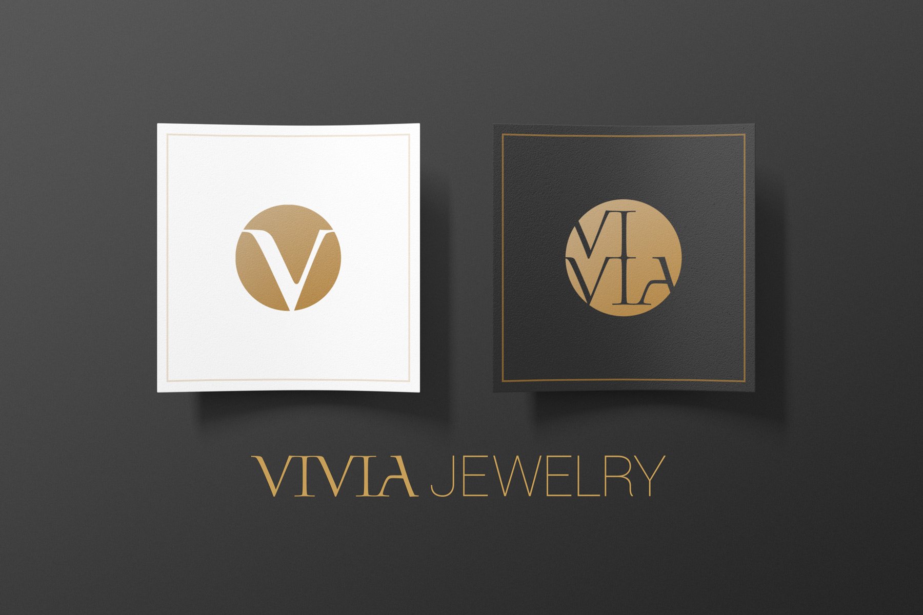
The lettering of the word strongly favoured a typographic logo/brand design. A base typeface ‘Blue Island’ was selected as having suitable properties, and modified to bring out inherent strengths of the VIVIA characters. This treatment reflects the delicate balance of sharp and soft in the lettering – and thereby encapsulates the appealing energy of jewelry and its gems.
The brand name also required an icon logo as a mark for presentation uses, and in particular capable of being engraved as a mark of artisanship. The initial letter V was bolded and treated to emphasise contrast of strokes, and to smooth the letter’s sharp elements.
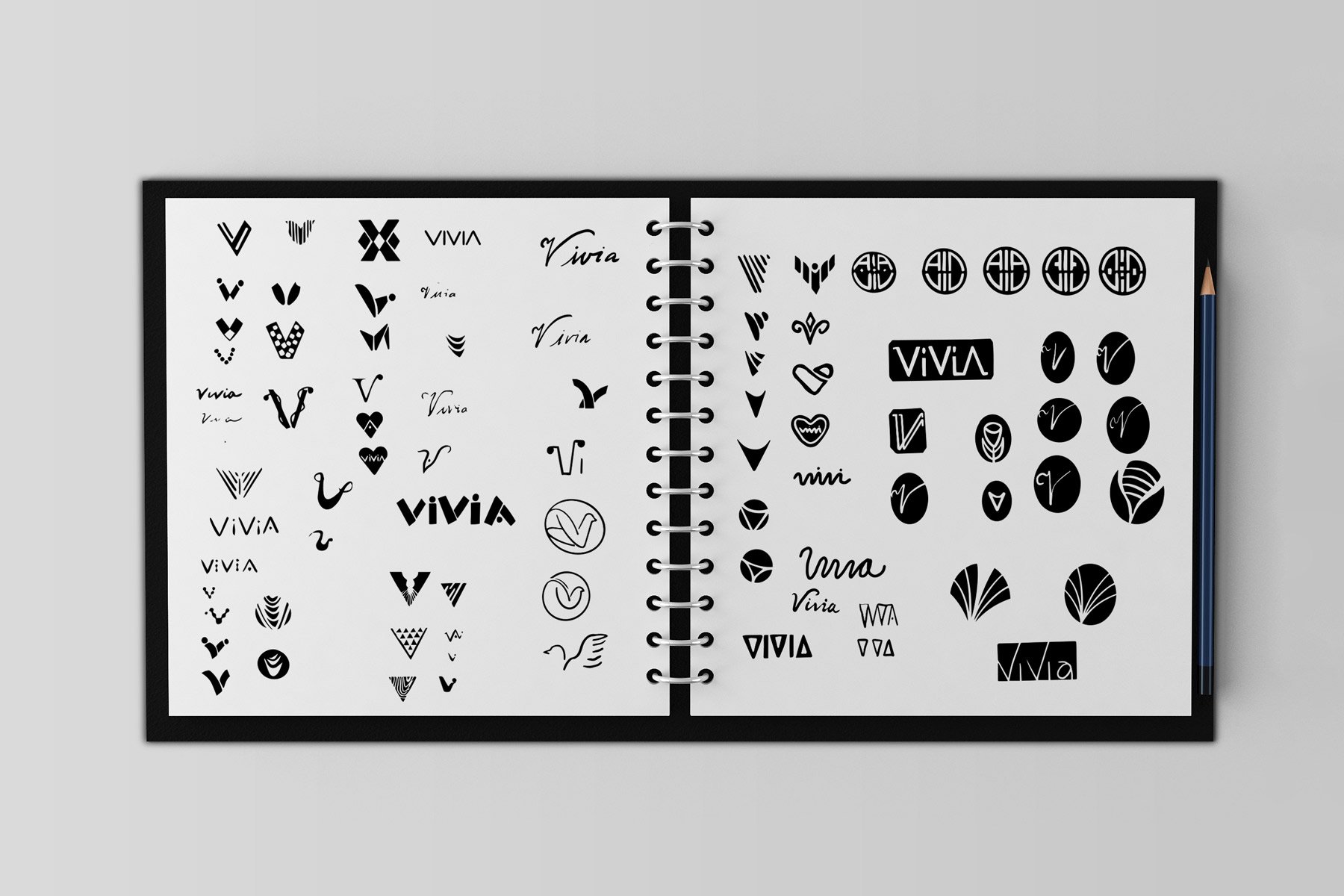


The brand VIVIA also required an icon logo as a mark for presentation uses, and in particular capable of being engraved as a mark of artisanship.


A set of logo designs was created for VIVIA jewelry for various purposes ranging from artisanship engravement, store signage, packaging, online business, internal/external communication, and brand jewelry designs.
